How It Works For Home Service Websites
When someone lands on your website, they are not always sitting at a desk. More often than not, they’re on their phone, looking for a solution, and trying to find it fast.
Your customer might be on their cellphone in the driveway, standing in their kitchen in front of a leak, or searching for help as quickly as possible.
In these moments, your website has one goal. It needs to work quickly, clearly, and without frustration on whatever device they’re using.
This is where responsive web design comes into play.

What Is Responsive Web Design?
Responsive web design is an approach to building websites that allows them to automatically adjust to different screen sizes and devices.
Instead of making separate versions of a website for desktop and mobile, a responsive site uses one layout that adapts on its own, depending on how it’s being viewed.
This means your website can:
- Resize text so it is easy to read on smaller screens
- Reorganize content into a vertical layout
- Adjust images so they load and display properly
- Make buttons easier to tap on a phone
The goal is to create a consistent and usable experience whether someone is on a computer, tablet, or smartphone.
How Responsive Web Design Works
Responsive web design works by using flexible layouts and rules that allow a website to shift and change based on screen size.
When someone opens your website, their browser detects things like screen width and device type. The site then adjusts automatically to fit those parameters.
This is typically done through a combination of:
- Flexible layouts that scale instead of staying fixed
- Images that resize within their containers so they do not break the page
- Code rules that tell the site how to display content at different screen sizes
Instead of building multiple versions of a website, responsive design allows one site to adapt to all devices. This makes it more efficient to manage and more consistent for users.
Why Responsive Web Design Matters for Home Service Businesses
For home service companies, most searches happen on mobile devices.
Customers are often dealing with urgent problems and need to find a solution quickly. They are not taking the time to navigate a complicated website from a desktop computer.
If your website is difficult to use on a phone, you are creating a bad experience and losing potential customers. This hurts your overall website conversion rate.
A non responsive site can lead to:
- Visitors leaving before taking action
- Lower engagement and shorter site visits
- Fewer calls and form submissions
A responsive site removes these barriers and helps users move forward quickly.
Key Components of a Mobile Friendly Website
A responsive website needs to do more than just fit on a smaller screen. It should also be easy to use and efficient.
Some of the most important characteristics of responsive websites include:
Readability
Users should be able to read your content easily without zooming in or adjusting their screen. Text should be clear, properly sized, and spaced in a way that makes scanning simple and fast.
Usability
Visitors should be able to navigate your site without confusion. A well designed mobile experience lets users find what they need quickly and complete actions without friction.
Speed
Mobile users need fast load times. If a page takes too long to load, users are more likely to leave before ever interacting with your site.
Simple Navigation
Menus, buttons, and links should be easy to find and use. Many mobile friendly websites use simplified navigation structures to help users move through the site efficiently.
These elements work together to improve both user experience and engagement
Responsive Web Design and SEO Performance
Responsive design also plays an important role in how your website performs in search results.
Google uses mobile first indexing, which means it primarily evaluates the mobile version of your site when determining rankings. If your website does not perform well on mobile, it will impact your visibility even if your desktop version is strong.
A responsive website supports SEO by:
- Improving page speed
- Reducing bounce rates
- Providing a better overall user experience
Remember, search engines prioritize websites that offer a positive experience, especially on mobile devices.
Responsive vs Adaptive Web Design: What’s The Difference?
Responsive and adaptive design can both be used to create mobile-friendly websites, but the way they operate is different.
Responsive design uses one flexible layout that adjusts to any screen size. Adaptive design uses multiple fixed layouts that are designed for specific screen sizes and devices.
Responsive design is generally more flexible and future-proof because it can adapt to new devices without needing additional layouts.
For home service businesses, responsive design is the most practical website option because it provides consistency across all devices.
How to Improve Your Website’s Mobile Experience
If you are not sure whether your website is responsive, the easiest way to check is to use it yourself on a phone.
Pay attention to how it feels to navigate and take action.
Some simple improvements include:
- Using readable font sizes that do not require zooming
- Adding space between buttons so they are easy to tap
- Keeping layouts simple and easy to scroll
- Optimizing images so they load quickly
- Making contact information easy to find and use
Regular testing is also important! Viewing your site on different devices can help identify issues you may not notice otherwise .
How Responsive Websites Turn Traffic Into Leads
You can invest in SEO and drive traffic to your site, but if users can’t easily interact with your website on their device, that traffic won’t convert.
A responsive website helps bridge the gap between customers finding your site, then taking action to book your services.
At VIIRL, we focus on both sides of that equation. We look at how your business gets found online, and how your website performs once someone lands on it.
We know that growth does not come from traffic alone. It comes from turning that traffic into real opportunities. If you are not sure how your website is performing, start with a free website audit from our expert team to help identify areas for improvement.
Why Responsive Web Design Is Essential for Modern Contractor Websites
Having a responsive website that’s fast, well-designed, and easy to use, is non-negotiable in 2026. With the majority of users searching on mobile devices, your website needs to meet customers where they are and provide a seamless experience.
A well-designed responsive site makes it easier for people to find information, trust your business, and take action.
And in home services, where timing and convenience matter, that can make the difference between winning a job and losing it.
FAQ
Responsive design is actually a combination of both UX and UI.
UI refers to how your website looks, including layout, buttons, and visual elements. UX focuses on how easy your website is to use.
Responsive web design impacts both because it controls how your site appears and functions across different devices. A well designed responsive site not only looks good on mobile but also makes it easy for users to navigate, find information, and take action.
In web engineering, responsive web design is a method of building websites that automatically adjust their layout and content based on the user’s device.
This is done using flexible layouts, scalable images, and rules that detect screen size and adjust the design accordingly. Instead of creating separate versions of a website for desktop and mobile, responsive design allows one website to adapt to all devices. This makes it more efficient to manage and provides a consistent experience for users.
Most modern websites use responsive web design.
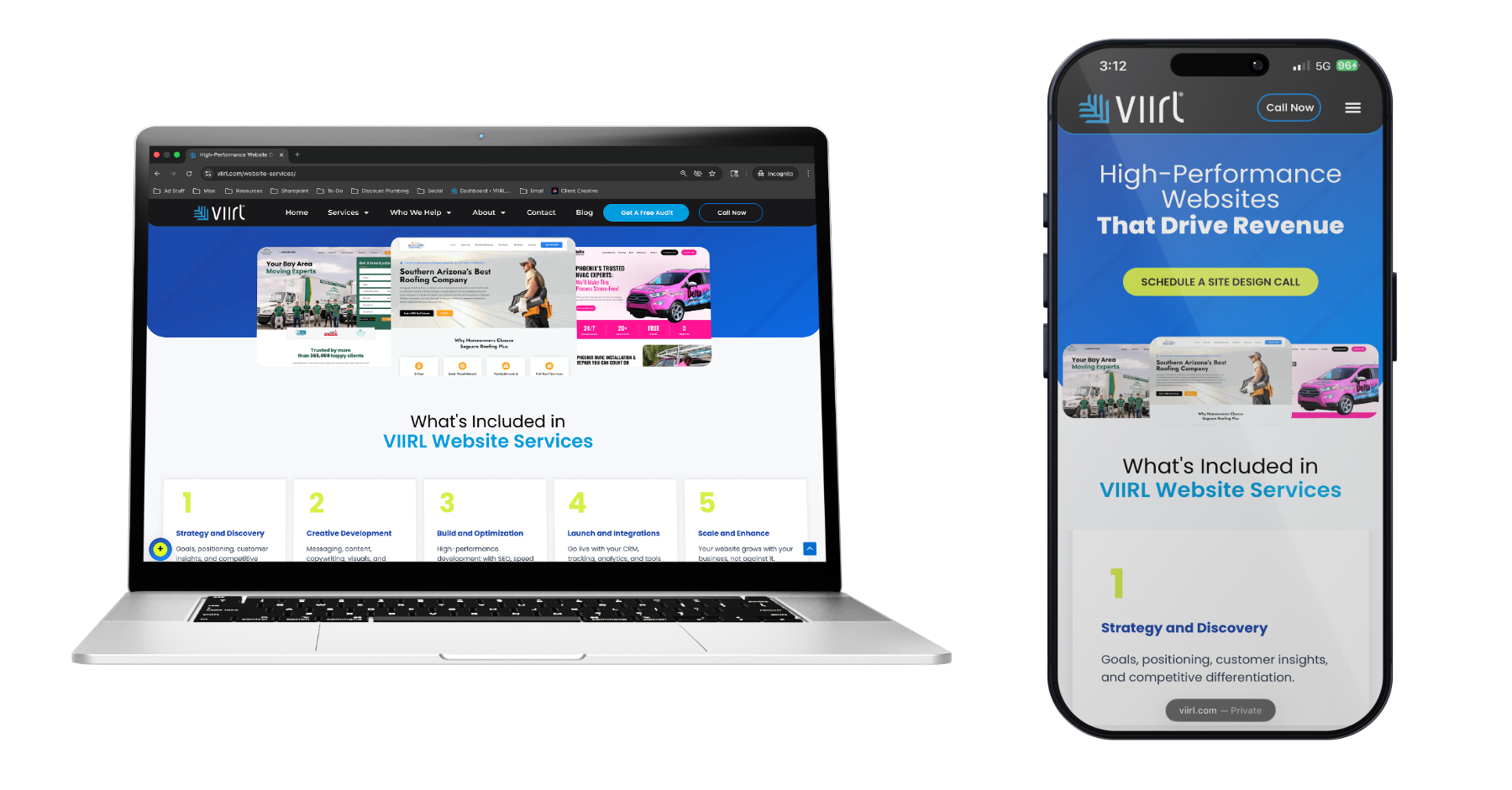
A simple example would be a contractor’s website that displays differently depending on the device:
-On desktop, the site may show multiple columns, detailed navigation, and larger images
-On mobile, the same site shifts to a single column layout with larger buttons and simplified navigation
The content stays the same, but the layout adjusts to make it easier to use on smaller screens. If you resize your browser window on a responsive website, you can often see the layout shift in real time.
Responsive web design is important because most users are now browsing on mobile devices. If your website is not easy to use on a phone or tablet, visitors are more likely to leave before taking action.
It also impacts your visibility in search results. Google uses mobile first indexing, which means it evaluates the mobile version of your site when determining rankings.
A responsive website helps improve user experience, engagement, conversion rates, and SEO performance. For home service businesses, this directly affects how many visitors turn into calls and booked jobs.
Making a website responsive typically involves both design and development updates.
Some key steps include:
-Using flexible layouts that adjust to different screen sizes
-Optimizing images so they load quickly and scale properly
-Making sure text is readable without zooming
-Making buttons and links easy to tap on mobile
-Simplifying navigation so users can find information quickly
It is also important to test your website on different devices and screen sizes to make sure everything works as expected. For many businesses, improving responsiveness may require updates to their website design or working with a team that understands mobile optimization.